Winner app
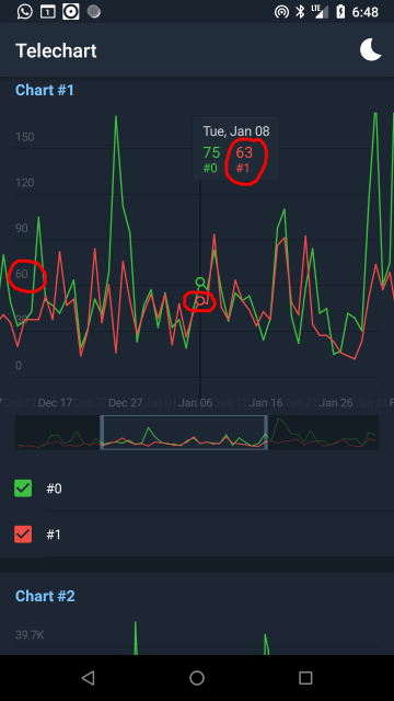
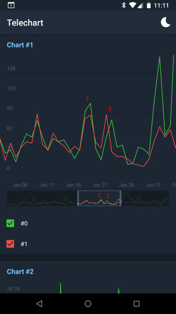
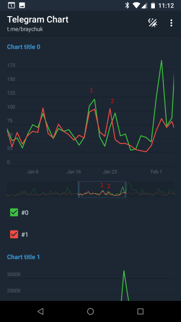
The chart isn't showing correct info, looks like the main goal of the contest failed?

This was the only contest I participated since I can remember. I considered Telegram Team as a team of professionals. That why I decided to give it a try. Now, as many of other participants, I'm completely disappointed. So I decided to create comparison of the winner app vs my app and ask Telegram Team some questions (see at the bottom). Hope their answers will clarify something.
The goal of the contest was to create app showing several charts on one screen.
Proceed to CRITICAL ISSUES in the winner app
Proceed to my questions to Telegram Team
Looks like this was the key parameter. The main question is: How do they measure speed and performance? I tested on my Nexus 5X (not very new device, released in 2015). Didn't notice any difference. I also tried to compare on very low performing device Samsung Galaxy J1 Ace (SM-J110H) working on Android 4.4, but the winner app does not supports this API level. Then I compared on emulator (is there a real devices slower then emulator?) and yes, looks like winner app behaves a VERY LITTLE bit smoother. But I don't think this little difference may compensate such amount of issues (see below).
When you compare performance please note that animations in my app is slightly longer. This is not because of performance. This is just duration parameter.
Videos below recorded from my Nexus 5X. It is not good to compare performance by video, so I would suggest you to download apks and compare by yourself on a real device:
Download APK-files: winner app, my app.
Update At the request of the winner, adding video comparison with GPU profiling enabled. With this profiling enabled we could see that winner app's drawing is better optimized. But as I said above I don't think that this optimization (invisible to user) pays off all the issues (visible to user) listed below. You should first create a chart that at least showing correct info. And only then you could start performance optimizations.
233Kb
859Kb
My APK is bigger because I decided to support Android version down to 4.0. Winner app only supports Android 5.0 and above. But there still significant amount of devices that is on Android 4.4 and below (more than 10% as of Oct 2018). So I consider this as a [CRITICAL ISSUE].
The chart isn't showing correct info, looks like the main goal of the contest failed?

Different shape on preview and actual chart (looses peaks)

Same shape on preview and actual chart

If other components on the screen will have same behaviour you it will be impossible to scroll at all
Not the requirement
Dates displayed by priority: year start -> jul 1 (year middle)
-> apr 1, oct 1 (quarters start) -> other months 1st -> month middle -> etc.
Хорошее приложение. К сожалению, есть замедления при фильтрации последнего графика на слабых устройствах (Galaxy S5, Xiaomi Redmi Note 4). Кроме того, плашка с информацией о точке скрывается при смене темы, но не скрывается при нажатии на неё.
Good app. Unfortunately there is a lags when you filtering the last chart on slow devices (Galaxy S5, Xiaomi Redmi Note 4). Also, the info panel for the date hides on theme switch but not hides when you tap on it.
Unfortunately there is no info about what kind of lags there was? Is it was heavy lags (don't think so) or just slight lags? And what about info panel? There was no any requirement when it should disappear. I decided to hide it on chart scroll or zoom. I wonder if all the issues above was mentioned in the winner app review? Should be quite big review.
Somebody's joke from contest chat:

-You told us that your charts are fast
-Yes
-But the values are incorrect
-Still fast tho
-Winner